Tools: Adobe Illustrator, Adobe InDesign, Adobe After Effects
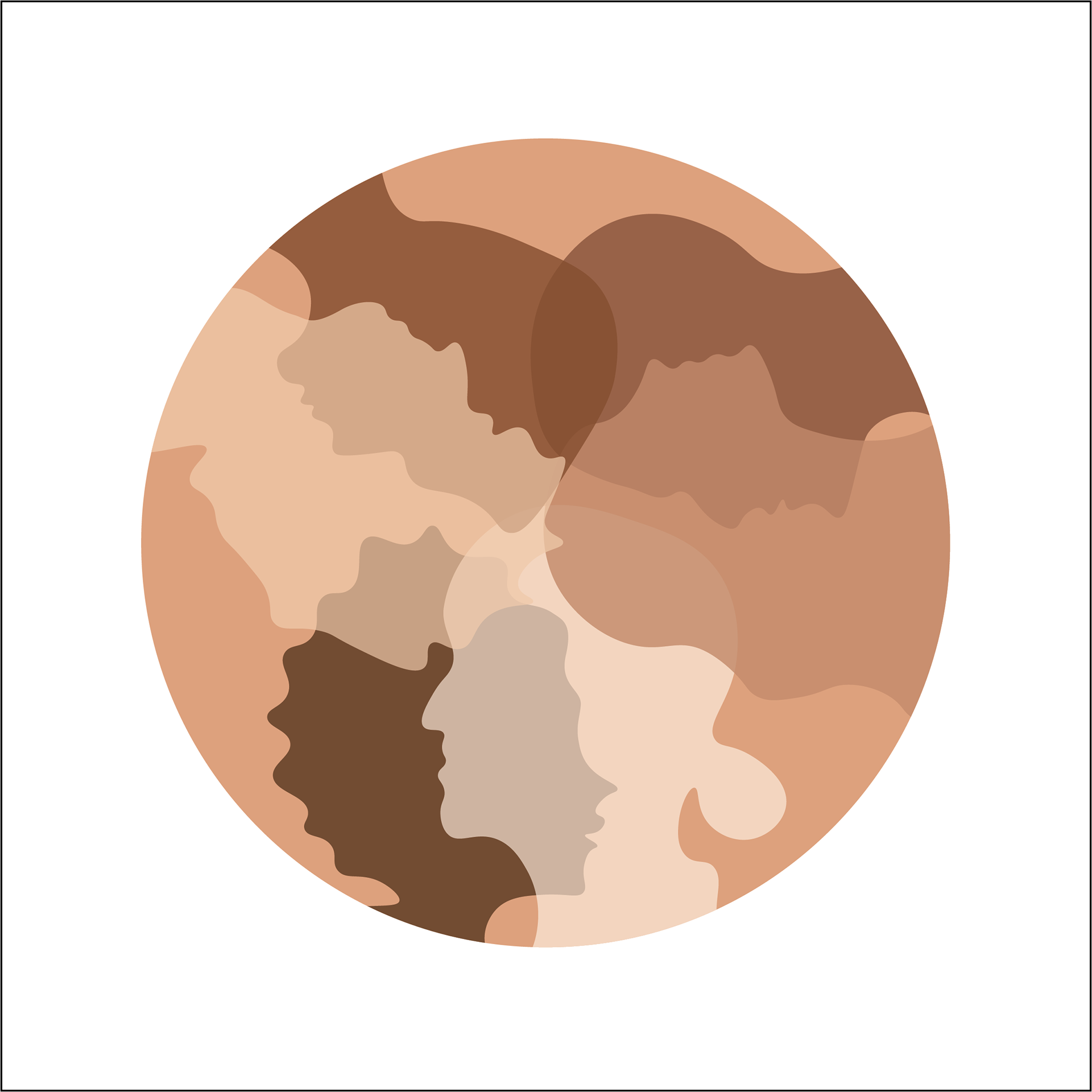
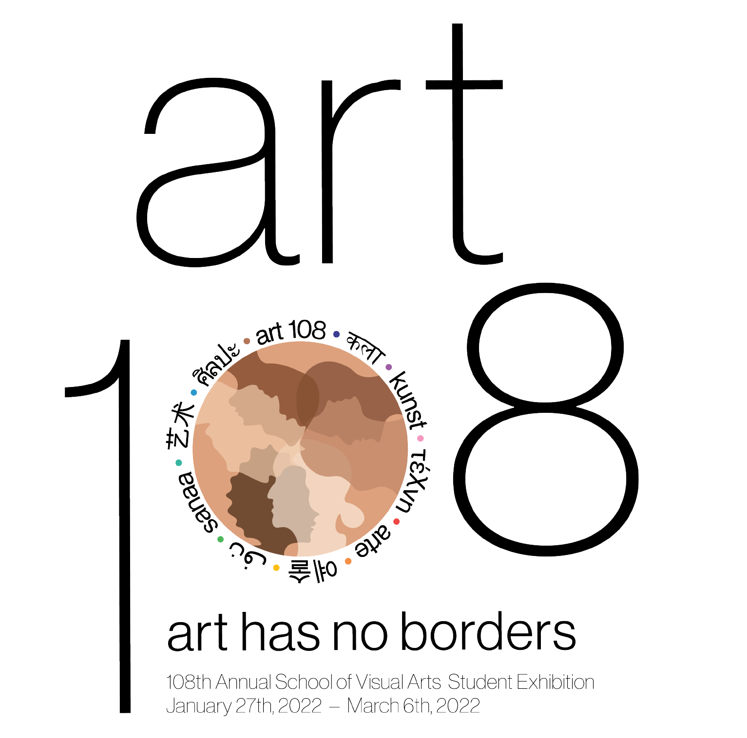
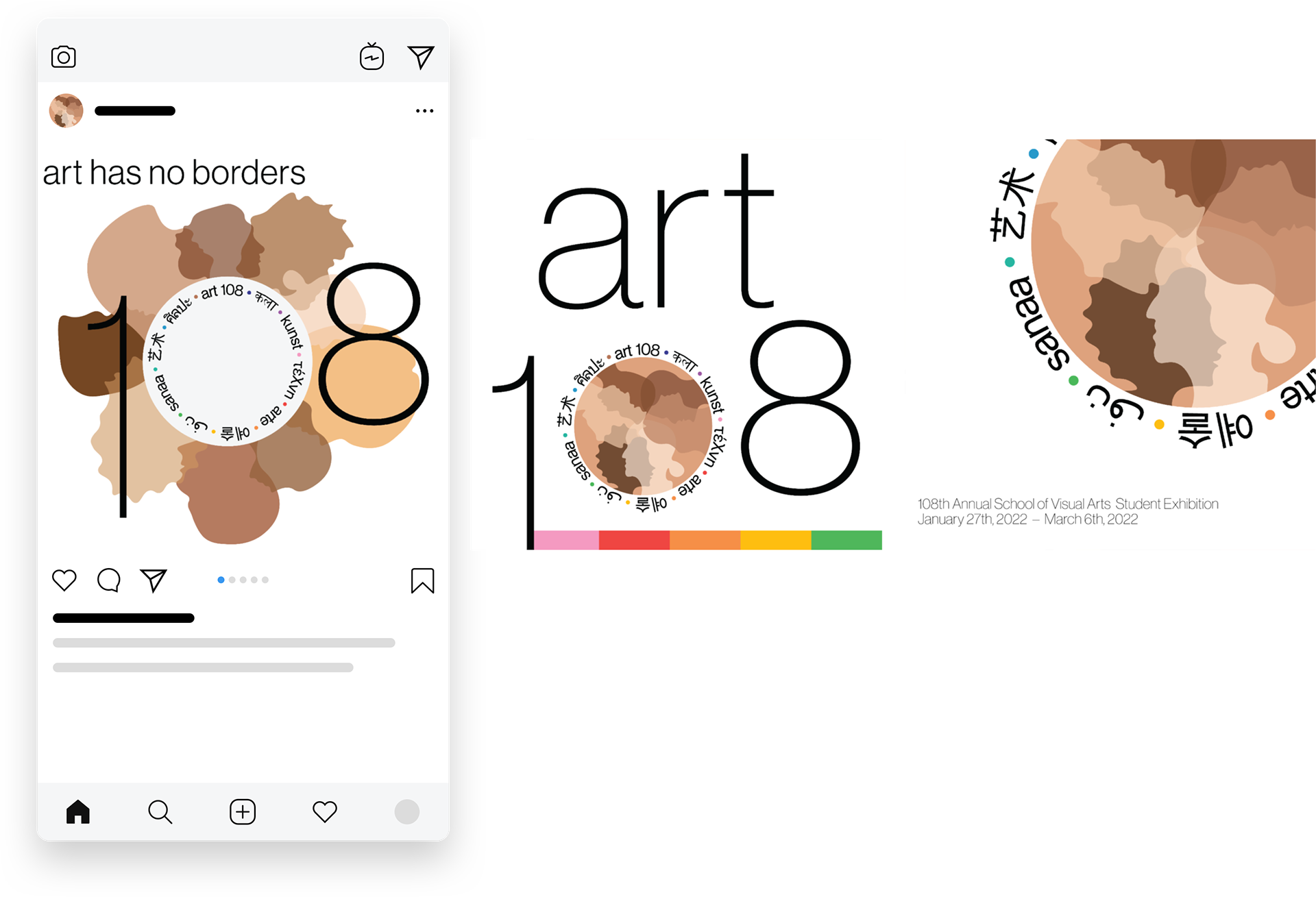
The goal of this project was to develop a visual identity for the 108th Annual School of Visual Arts Student Exhibition. Before beginning the design process, my partner and I grounded the project in our definition of art: an international language understood by all. This philosophy informed every aspect of the brand.
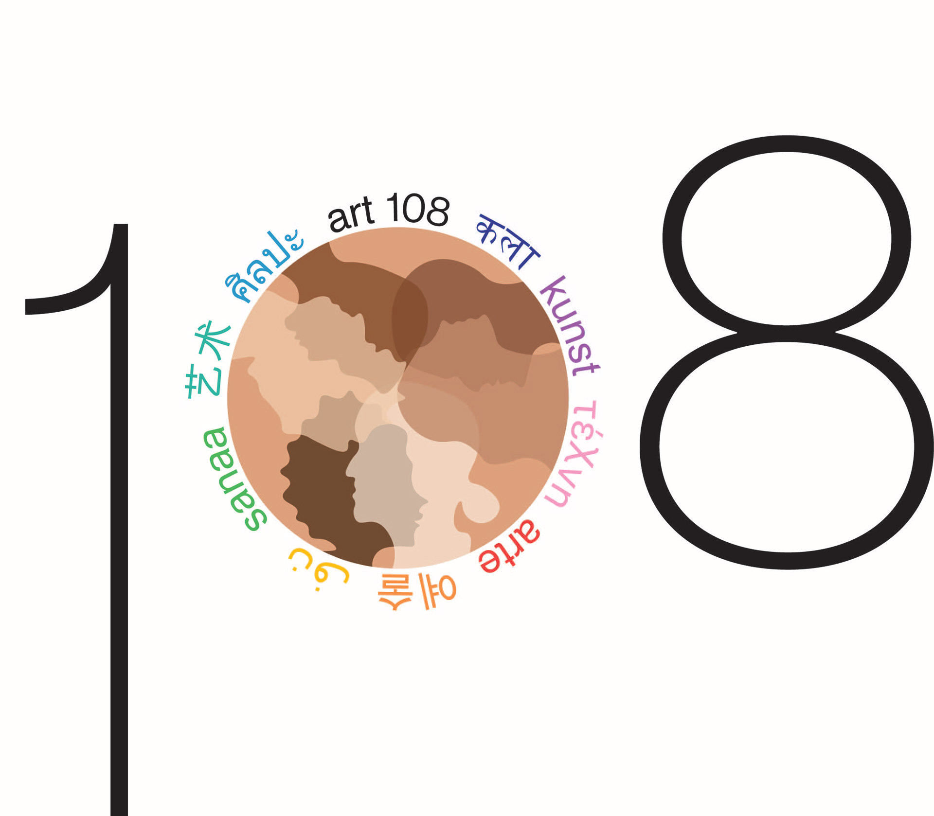
We chose a vibrant and diverse color palette to reflect inclusivity and the idea that all colors—like all people—contribute to the creation and richness of art. The visual system incorporated ten languages, selected not only for their global prominence but also for regional and minority representation, as well as visual diversity in the final design lockup.
To further engage visitors, we proposed an educational space within the exhibition, encouraging interaction, learning, and a deeper connection with the work on display.
Logo Lockup
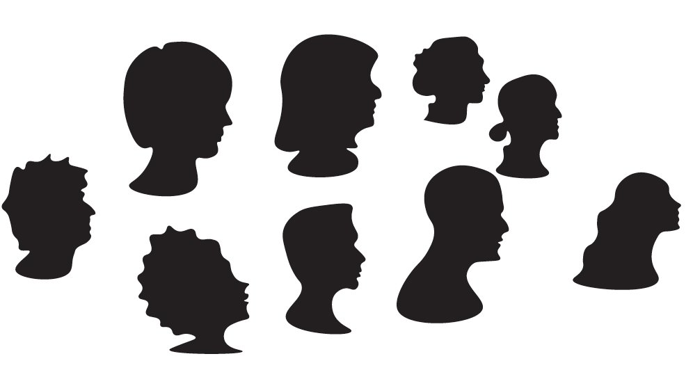
The education space of the exhibition allows children and people of all ages to create their own abstract art forms similar to the mark. They will draw their form on thick black paper and cut it out. Then they would stick a pre-cut magnet on the back of their form, and they had the choice to take it home as a souvenir or display it on the magnet board where all the other forms from before them had been created.
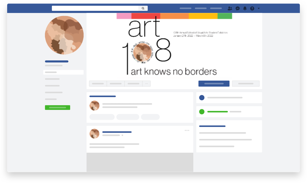
Social Media
Deliverables
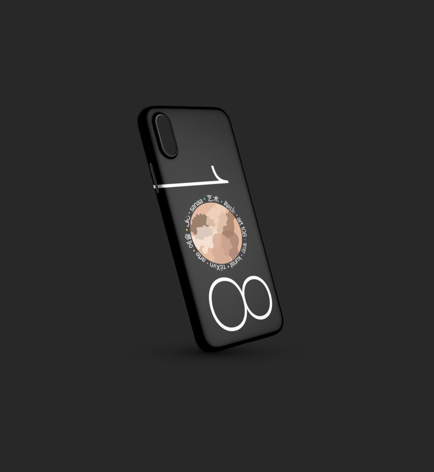
Logo Phone Case
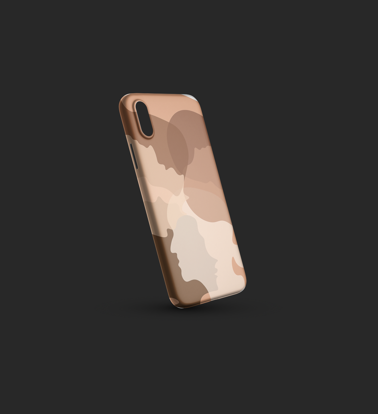
Pattern Phone Case
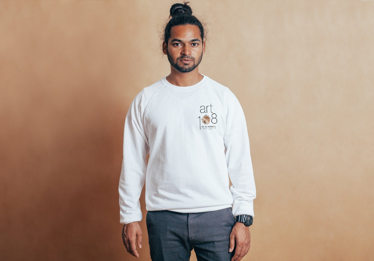
Sweatshirt (front)
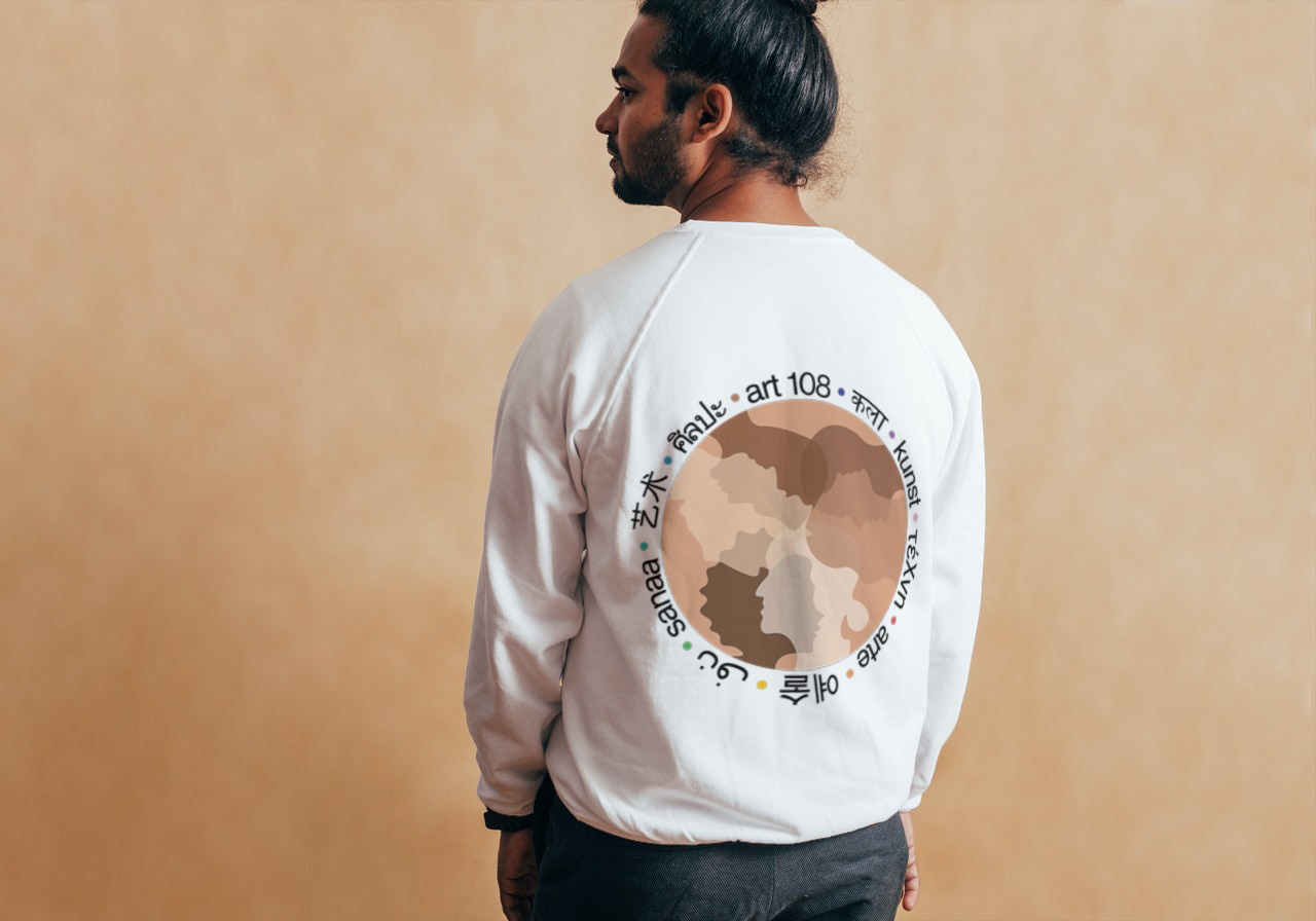
Sweatshirt (back)

KN95 Mask

Cloth Mask
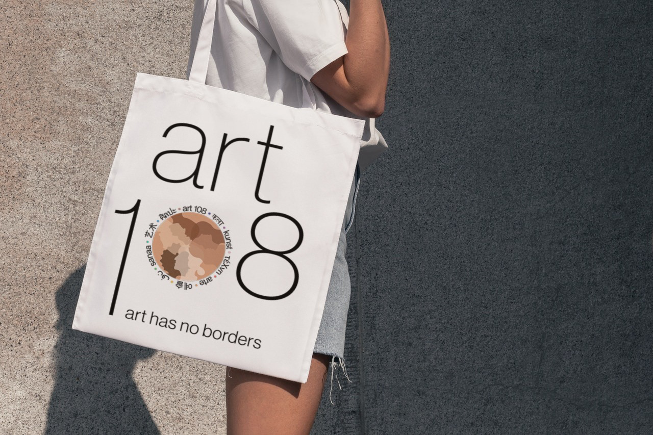
Regular Tote Bag
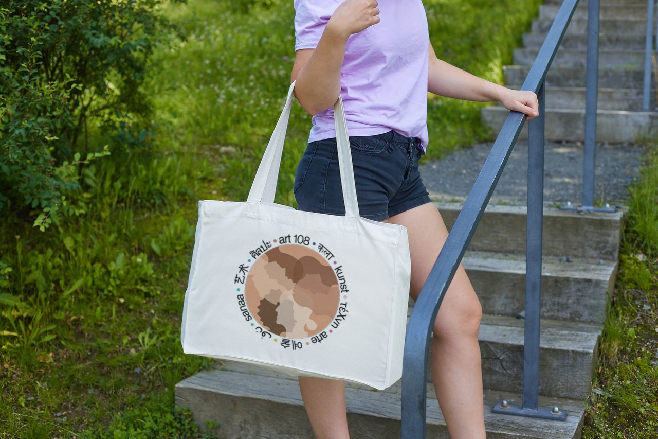
Large Tote Bag

Mug
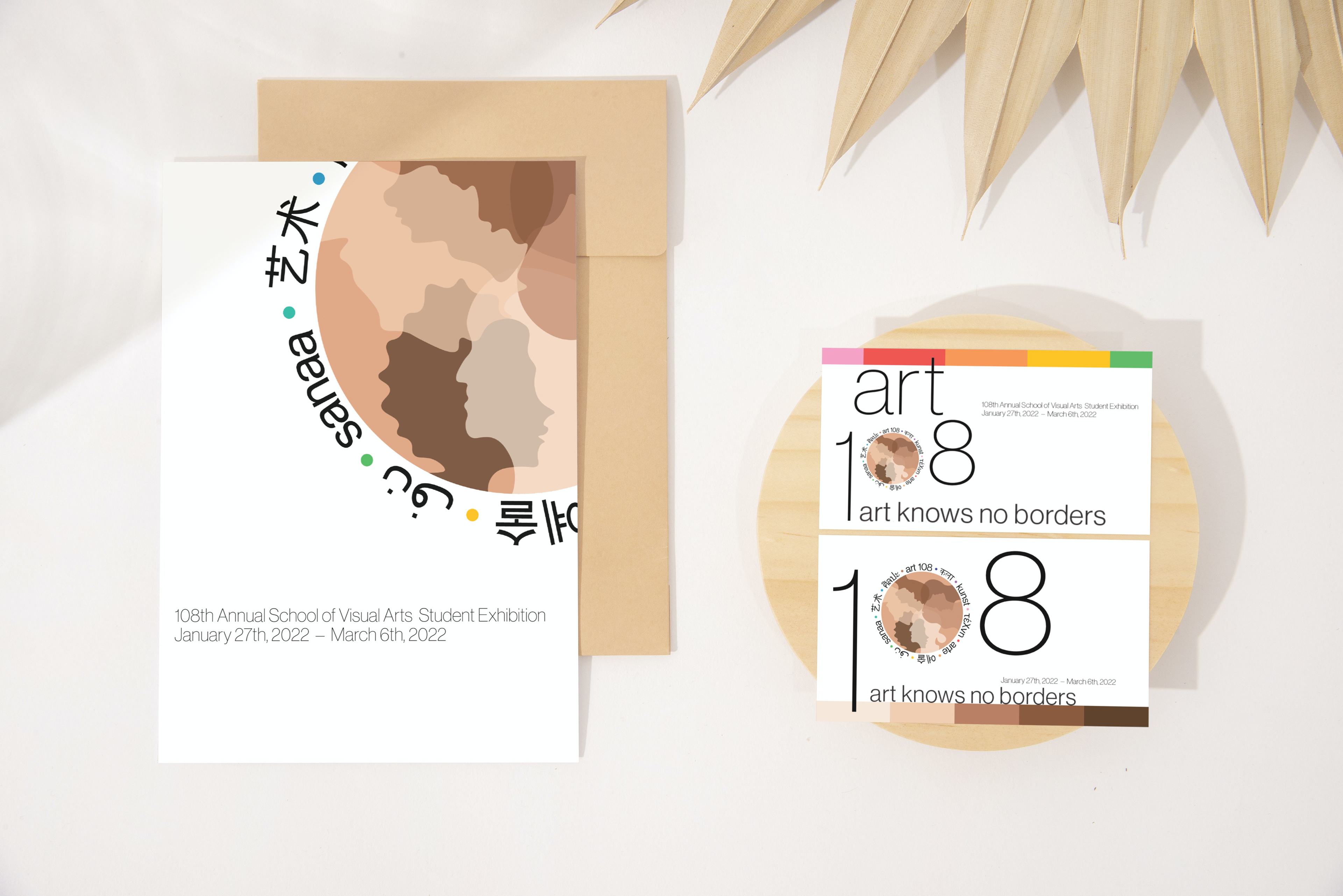
Cards
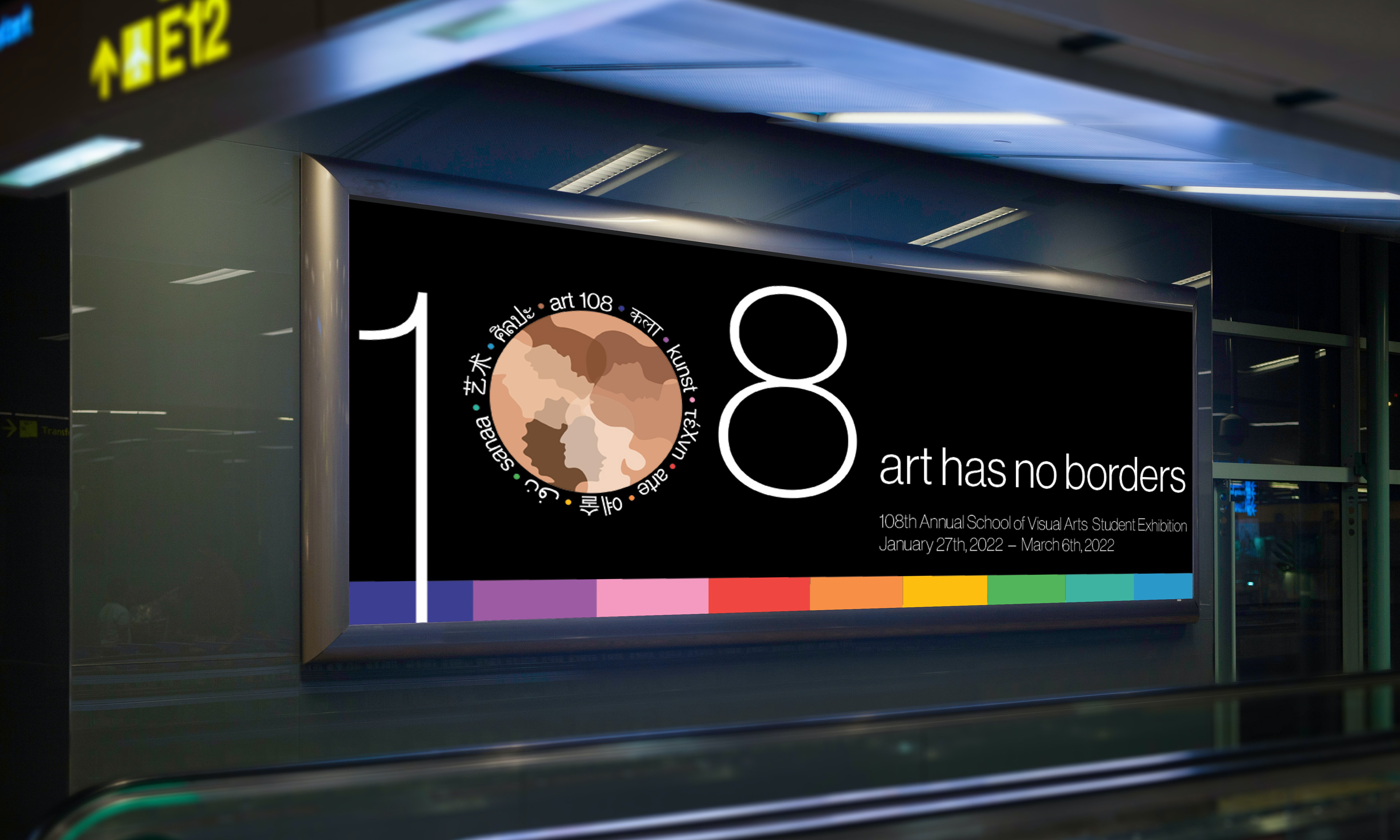
This banner is displayed outside in a city area.
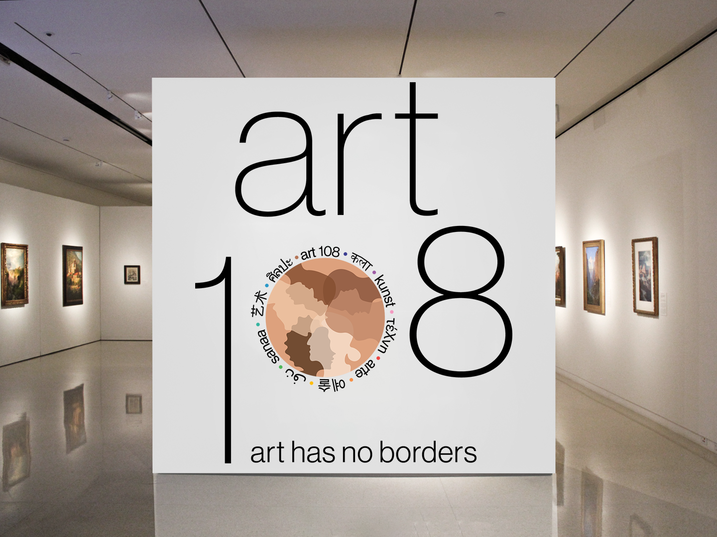
The brand is projected on the gallery wall located near the entrance of the exhibition.
Below is the animation of what will be projected and played throughout the exhibition.