Tools: Adobe Illustrator
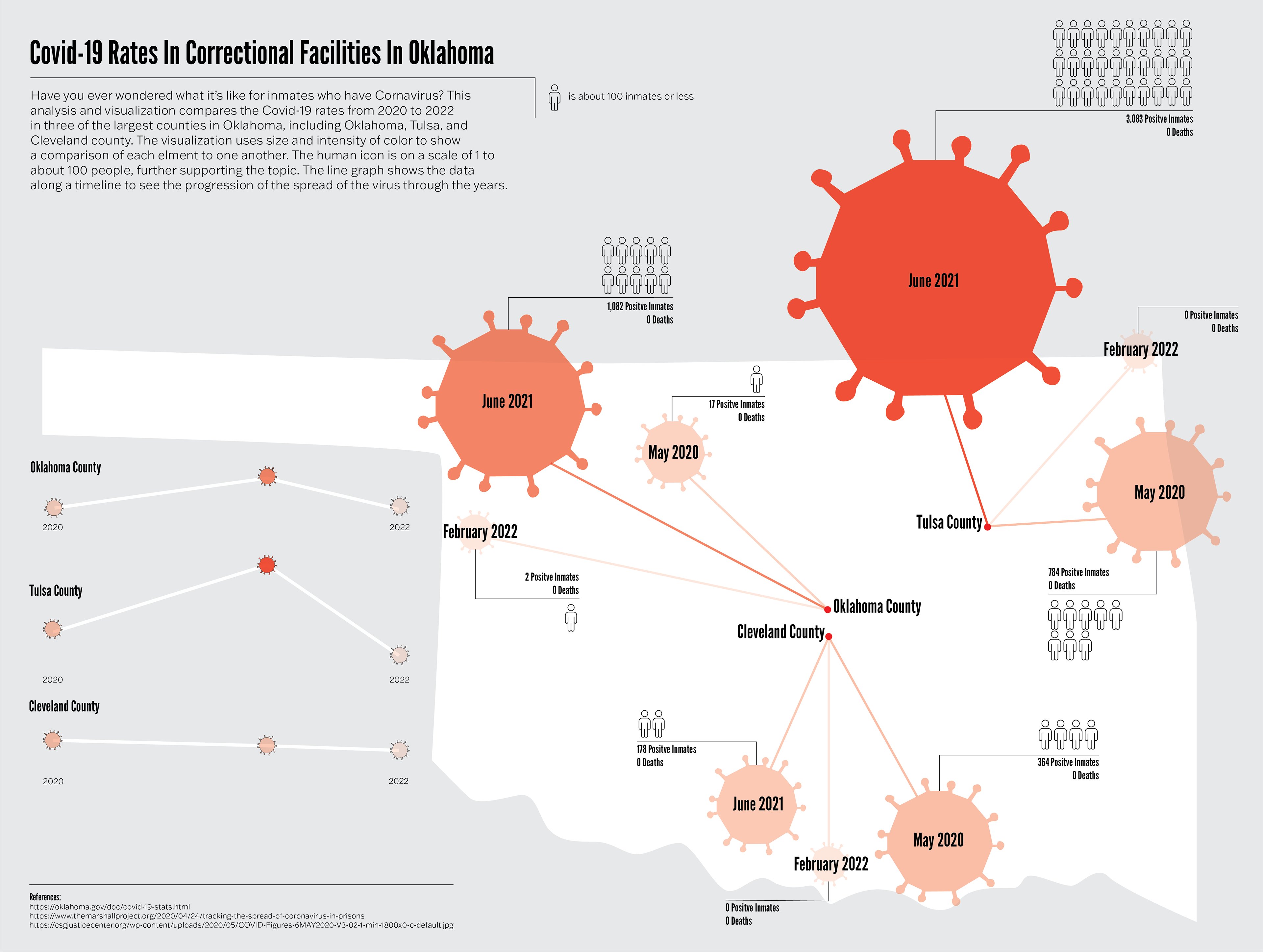
This infographic explores the COVID-19 rates in correctional facilities, comparing data from 2020 to 2022 in the three largest counties in Oklahoma: Oklahoma, Tulsa, and Cleveland counties. The infographic takes a lot of data and research on this topic into a very clear and simple-looking infographic for the audience to better navigate and comprehend.